Scale and Mark: Matching Tools to What You Want to See
Problem
It is easy to assume that better sight comes from longer looking. Often the real obstacle is a mismatch between what you see and the marks you make. A too-large brush smears out the detail of lichen on a stone; a needle-fine pen suggests precision where tonal mass is what matters; a habitually held medium flattens the rhythm of a fence receding into space. These mismatches make studies feel wrong — not because observation failed, but because the tool and the scale of the mark failed to translate what attention had gathered.
This piece offers a purposeful framework for choosing scale and mark so that a study preserves the relationships you intended to notice.
Principles
1. Match mark-size to informational scale
Determine the smallest unit you need to record. Is it the grain of moss, the pattern of light on water, or the overall sweep of a hillside? Use a mark roughly the same size as that unit. Too-large marks merge separate observations; too-small marks bury the gestalt in detail.
2. Prioritize relational marks over isolated detail
Think in terms of connections: edge-to-edge, light-to-dark proportions, and the rhythm between repeated elements. A single precise line is less useful than a slightly broader stroke that establishes where a form begins and how it sits relative to neighbors.
3. Use contrast to define scale
Value and edge contrast set perceived scale. Strong high-contrast edges make forms read larger and closer; soft low-contrast edges push them back. Choose mark density and hardness to build the appropriate contrasts.
4. Reserve fine marks for verification, not construction
Small, detailed marks are best used at the end to confirm an impression. Construct the study with broader marks that hold structure; add finerscale corrections sparingly.
5. Vary mark rhythm to indicate texture and distance
Uniform marks flatten a surface. Alternating lengths, densities, and directions suggest texture and help imply depth without literal detail. A handful of deliberate, varied marks can communicate more than many identical strokes.
Examples
Example 1: Moss and lichen on a stone (close scale)
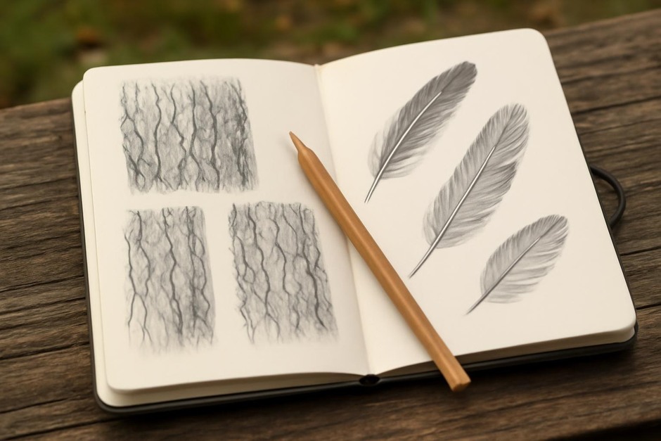
Problem to solve: convey carpeted texture without making a jumble of dots. Approach: choose a soft round brush or a round-tipped pen that makes a slightly thicker dot. Work in overlapping, short strokes that follow the rock’s contours. Begin with a few darker masses to anchor value; add mid-tone clusters to suggest volume; use sparing tiny highlights to imply dampness. Result: texture reads because marks are at the scale of clumps rather than individual specks.
Example 2: A fence receding across a field (mid range)
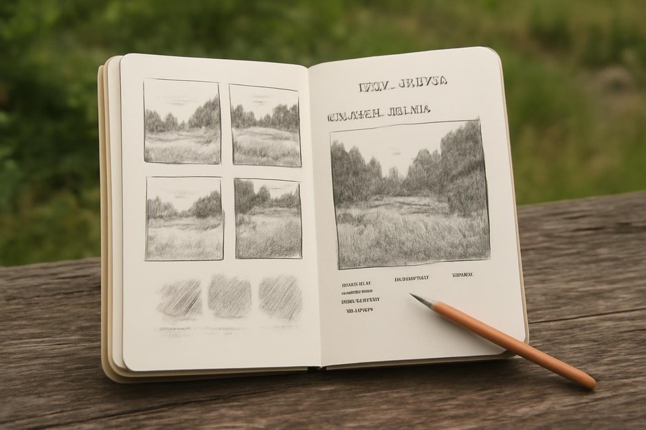
Problem to solve: make the rhythm of posts and rails recede convincingly. Approach: start with a horizontal wash or broad pencil sweep to establish the ground plane. Place fence posts with moderately sized vertical marks, decreasing their height and edge sharpness as they recede. Instead of detailing each board, suggest repetition by rhythm and interval. Vary mark weight slightly to avoid mechanical uniformity. Result: the fence reads as a series of receding beats rather than a line of drawn symbols.
Example 3: A small puddle reflecting sky (broad scale with subtle interior)
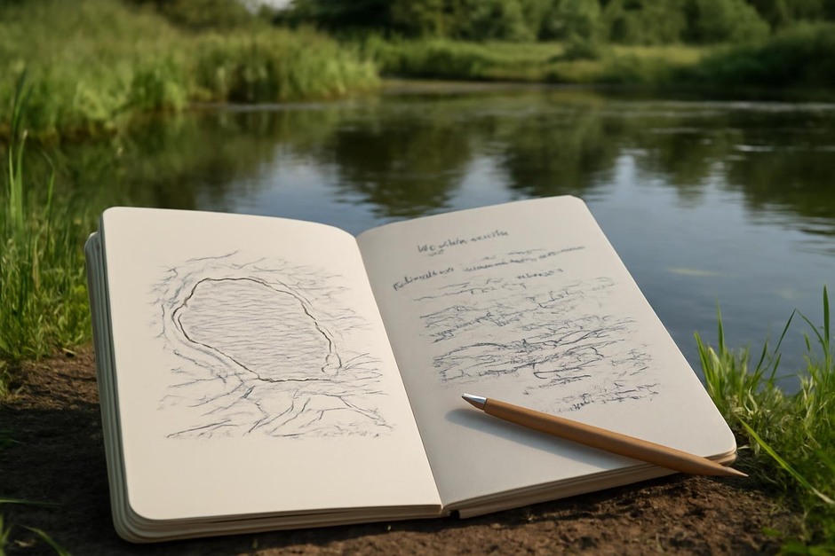
Problem to solve: show a shallow plane with a reflection that has delicate value shifts. Approach: use broad, soft marks to block the puddle’s main dark and light zones, keeping edges slightly blurred where water meets mud. Build interior subtlety with thin glazes or diluted washes — not with many tiny strokes. Keep contrast low within the reflection and stronger at the puddle’s edge to imply surface tension. Result: the reflection feels integrated with the landscape instead of a detailed picture placed inside a shape.
Practice Checklist
- Identify the informational scale: what is the smallest unit worth recording here?
- Select a primary mark: choose a brush, pen, or pencil that makes marks at that scale.
- Construct with broad relations first: establish major masses, edges, and rhythms before adding detail.
- Adjust contrast deliberately: use sharper marks for nearer or more important elements; soften others.
- Add fine marks sparingly: use small marks only to confirm or correct, not to build structure.
- Vary rhythm and direction: break uniformity to suggest texture and distance.
- Step back and re-evaluate: check whether the marks you made preserve the relationships you noticed.
Working with scale and mark is a modest discipline: a short adjustment of tool or gesture often rescues a study from mis-translation. The reward is plain — your sketches will show not just what you looked at, but what you actually saw.